Community Learning Course “Visual Rhetorics” Designs New Trinfo and Community Organization Logos
In the spring semester of 2020, Professor Nick Marino set out to teach his course, Visual Rhetorics, with a new Community Learning curriculum. The course teaches students about how messages are communicated through visuals, font, typography, and photography for persuasion. “We are totally saturated in a visual culture,” says Marino, expressing the importance of visual rhetoric skills in today’s state of technology.
The class started with looking at photographs from Pulitzer Prize winners and learning design terms and concepts through them. These skills prepared the class to strategically understand how to manipulate and create visuals that invoke audiences to feel or do something. After critiquing visuals, the class started producing.
Marino taught the Visual Rhetorics course once before deciding to transform it into a Community Learning course. He believes that the liberal arts environment and curriculum presents an “opportunity to cultivate different ways to see communication.” In addition to cultivating these wide and varied perspectives of communication, the Community Learning framework also allows the school and students to continue cultivating a relationship with Hartford. Marino shares, “I love Hartford and how Hartford can make our classroom better.” The students benefit from the real world learning, given that any chance for students to work with an audience better prepares them for post-grad opportunities.
However, Community Learning courses not only aim to enhance student learning, but also to contribute to Hartford community partners’ goals.In order to achieve this goal, the course worked with several organizations that needed logos, but might not have time to research visual rhetorics to create a brand that communicates their work and mission. This is where the students came in.
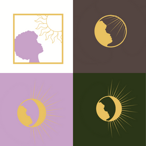
One partner the class worked with was reSET Social Enterprise Trust, a Hartford organization that works toward socially conscious entrepreneurship, helping community members start their own companies, and to continue these companies in and for the community. The course timeline lined up perfectly with reSET’s incubator, where the organization was choosing candidates for the start-up program. reSET sent out flyers to the chosen candidates about the opportunity to work with the Trinity students on a logo for their start-up. The students met with each of the candidates and learned about their start-ups over Zoom. They ended up choosing a start-up called Nourishing Habits with Stef, a wellness company for Black and Indigenous queer people. The students and Stef met over Zoom for feedback sessions. Stef Robles, of Nourishing Habits with Stef, expressed the collaboration as “My experience was lovely and it came at such an appreciated time. I work with entrepreneurs and startups– usually I’m the one giving out branding resources or supporting businesses through their own branding process. It was a different experience to be on the other side, having the space held for my dreams to be interpreted by a creative, whose designs will then be shared/displayed throughout Nourishing Habits w/Stef. It was wonderful talking about my mission/vision and being able to see the artistic, physical representations of what was interpreted! I am truly grateful to have gone through this experience with the students and would recommend it for startups who can explain what they are looking for, and have a willingness to work with students.”
It was wonderful talking about my mission/vision and being able to see the artistic, physical representations of what was interpreted! I am truly grateful to have gone through this experience with the students and would recommend it for startups who can explain what they are looking for, and have a willingness to work with students.
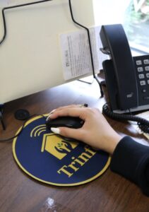
Another community organization the class met with was Trinity’s own Trinfo.Café. It was the 25th anniversary of Trinfo last year, so the rebranding logo came at an opportune time. Carlos Espinosa, Trinfo’s director, and Cynthia Mena, Trinfo’s program manager, met with the students in the class to brainstorm. They discussed the mission of Trinfo, and then the students presented several drafts and received feedback. The two final logos are now being rolled out as Trinfo makes new brochures, websites, flyers for events, and on swag such as mouse pads, phone card holders, and masks. The new horizontal logo symbolizes the interconnection of the community. The new circle logo symbolizes the access to wifi, the sharing and giving hands between Trinity and Hartford, and the seedling for the Trinfo community garden.
“It exceeded our expectations and we really embraced it,” Espinosa says of the new logos.
The community organizations did not hold back from feedback and believed in the students, and the students were involved and passionate. Marino says it was a “perfect collaboration. It takes a village to make a logo.” He will be teaching the course again this upcoming spring semester. He would also like to give a special shout out to Mary Mahoney, Digital Scholarship Coordinator, and Cait Kennedy, Research, Technology, and Outreach Librarian, as they provided technical assistance and software resources to create the logos.