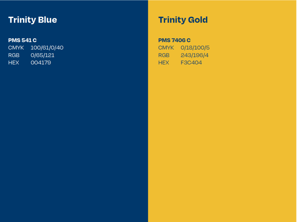
Primary Colors
Our primary palette consists of Trinity Blue and Trinity Gold. Our layouts lean heavily on these colors, mixing in the neutral and secondary color palettes to build color schemes that are complementary and balanced.
Coated Paper
When printing on most coated stocks, on specially treated uncoated paper, or on UV presses, use the Pantone spot color or the CMYK formulas specified.
Uncoated Paper
When printing on most uncoated stocks, we adjust the spot color and CMYK formula of the color palette to achieve the best results. Use the specified formulas shown here.

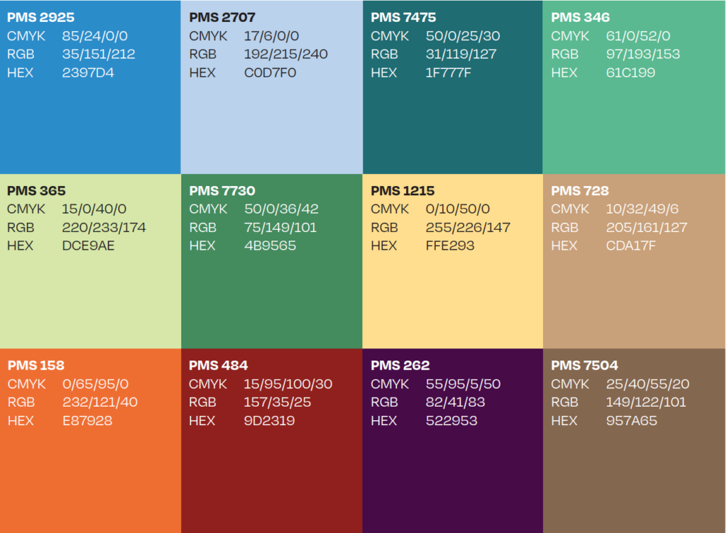
Secondary Colors
Our secondary palette is made up of vibrant hues and muted colors. The muted options work well as background floods of color. Use the vibrant accents to break up headlines, establish hierarchy, and create a more youthful vibe.
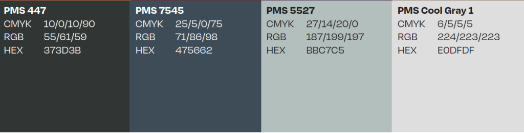
Neutral Colors
These neutral hues pair perfectly with the primary palette. Due to the subdued nature of these colors, overpowering the primary set is less of a concern. Use these as supplementary colors rather than driving colors in layout and materials.
Office of Communications and Marketing
300 Summit Street
Hartford, CT 06106