Typography
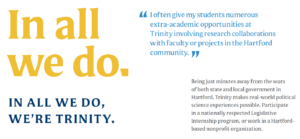
Typography is a robust vehicle for our brand voice. It contributes to how our messages are read and communicated.
It is one of the many facets of our visual identity that evokes the shapes and forms of campus architecture, drawing from the college’s history and unmistakable sense of place.
Degular
 Degular is a sans-serif font that works well for expressive headlines, subheads, callouts, and even body copy. The typeface has a modern but friendly appeal with some classic nuances.
Acceptable font weights:
- Light
- Light Italic
- Regular
- Italic
- Medium
- Medium Italic
- SemiBold
- SemiBold Italic
- Bold
- Bold Italic
- Black
- Black Italic
Mestiza
 Mestiza is our serif font. This elegantly designed typeface can be used as an accent in headlines and for small elements in layouts. In its lighter weights, whether used in all caps or sentence case, it has a more formal feel. When used in its heavier weights, it reveals a playful tone. Its fluid yet geometric structure and sharp serifs create a distinct textural contrast to Degular.
The typeface Mestiza was chosen in part to its similarity to the typeface found on classroom doors on Trinity’s campus. They have similarities between the sharp serifs and swooping letterforms. Mestiza also has some letterforms that reflect the elegant curves of the wooden arches found in the Long Walk classrooms.
Acceptable font weights:
- Light
- Light Italic
- Regular
- Regular Italic
- Medium
- Bold
- Bold Italic
- Black
- Black Italic
United Sans Condensed
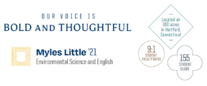
 United Sans Condensed is an accent type family that we use for callouts and labels. Its rigid and collegiate character adds a texture to our compositions not found in our other typefaces. Use it sparingly with our with our other brand fonts to create contrast within a headline, label, or factoid.
Acceptable font weights:
- Light
- Medium
- Bold
Alternate System Fonts
Our brand typefaces may not always be available to everyone for use in Word documents, PowerPoint presentations, and other digital applications. In these situations, use the alternate fonts listed here, which are freely available on all computers.
- Arial is the acceptable substitute for Degular
- Georgia is the acceptable substitute for Mestiza
- For designs in Canva: Martel (ultralight, regular, bold, and heavy) and Alegreya Sans (thin, regular, bold, and black)
Access to Brand Typefaces
Departments creating their own marketing pieces will have to purchase the typefaces for their individual offices/computer or use the secondary, open source typefaces (Arial and Georgia) that are freely available on all computer systems.
Note
Our approved brand typefaces don’t include the full range of weights from these font families. Although they are available, our brand does not and should not use any font weights other than those listed in this section.
Office of Communications and Marketing
300 Summit Street
Hartford, CT 06106
