A year ago, we began our work to strengthen Trinity’s distinctive position and visibility in the marketplace through a comprehensive branding refresh. In collaboration with our agency partner Ologie, we engaged in a research-informed process to develop a two-fold strategy: refining our positioning (core messaging, audiences, personality) and updating our visual identity.
Our branding refresh also is a framework that helps us focus our work as we head into our bicentennial celebration. The strategies and visual work of the brand refresh articulate the core values and offerings of the college—the things that have always been true about who we are—which we celebrate and rally around as we set our course for the college’s third century.
Our Strategy
Trinity has many great stories to tell, and the new platform will help us focus our efforts to tell them by distilling what makes our college unique—the differentiators that in combination create the Trinity experience—and what we value. It gives us the blueprint to build a stronger college, to deepen our engagement with our audiences, and to clearly and consistently communicate what the world can expect from us. In evaluating dynamics that distinguish us from other colleges, we found that the following three dimensions in combination are core to who we are:
- Connected Community
The Trinity community is tightly connected through time-honored friendships and a loyal network. Faculty and students develop close-knit bonds that shape a rigorous academic experience. Classmates stay connected for life and make great things happen together. - Determined Doers
Nothing can be accomplished well without people who are determined and willing. And that, at our hearts, is key: people driven to get good things done. With the spirit of innovation and a commitment to do well, students come to Trinity ready to apply what they learn through a liberal arts education to contribute to a better world. - Dynamic Location
It all begins in Hartford—our community and our home—where students gain an education enhanced by the capital city and the opportunities it affords.
These pillars are not taglines; rather, they are the three elements that inform how we make our messaging distinct among our peers and competitors.
Updates to Our Visual Identity
Along with a refreshed strategy, we have made several updates to our brand identity—the visual elements that make Trinity recognizable. These updates take the form of an updated primary wordmark, graphic elements, typefaces, and more. While we have developed a lengthy and comprehensive brand-guidelines document that details all the elements of the college’s brand and how to use them, below are highlights of what we’ve updated.
Primary Wordmark
Our new wordmark is inspired by elements of architecture and other landmarks on our campus. Each letterform is constructed to create an authentic connection to our home and to accurately reflect who we are; we also made sure that the mark is functional for all the needs of a contemporary logo.
![]()
![]()
College Seal
Our seal is an important part of our college’s heritage, and to honor its importance, we’ve refined it so that it can represent the college for another hundred years.
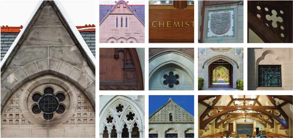
Architectural Glyphs
These graphic elements are versatile elements—they add depth, color, texture, and visual interest to any piece. They are drawn from the college’s historical elements, architectural stonework, and shapes found throughout campus, as seen in the photo grid here.
Core Glyphs

Pattern Blocks

Architectural Wireframes

Spirit Marks
We’ve extended our identity assets further with spirit marks, which convey a somewhat lighter tone. These flexible marks can work in more traditional settings or can act as casual shorthand for the college. Spirit marks are not primary marks or the college’s logo, and they aren’t used on their own.
 |
 |
 |
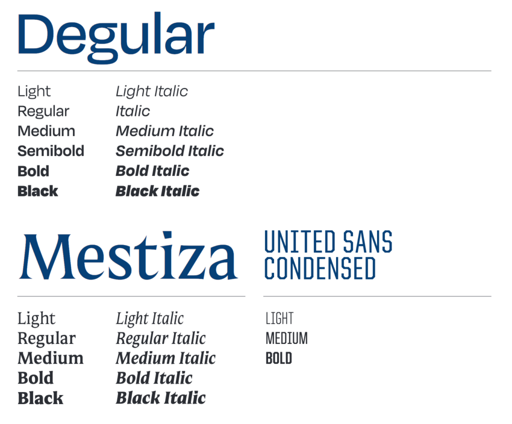
Typefaces
Typography is a robust vehicle for our brand voice. These three typefaces will be used in a variety of settings by the Communications Office for college-owned materials. These typefaces bring elements of modernity, friendliness, elegance, and collegiate character to our work.
Timeline for Rollout
The rollout of the refreshed brand begins with internal audiences—those whose work involves communicating and promoting on behalf of the college. We began this work in early June with two days of brand workshops led by Ologie and the Communications Office. More than 40 people from departments and divisions across the college engaged in intensive sessions that covered strategy, visual/creative elements, and writing for the brand. Responses from participants have been enthusiastic, and many individuals are beginning to think about and partner with us on using the brand within their work.
This summer, the Communications Office is busy preparing for a more public rollout at the start of the academic year. This includes a visual refresh of the college’s website (slated to go live in August); new admission publications; wordmark lockups for offices, departments, programs, and centers; updated stationery; updates in tone, voice, and messaging in our content; a brand resources hub for internal audiences; and many more applications as we move through the academic year.
The new visual identity resources will be available to the campus community at the start of the academic year.
As always, we welcome your ideas, questions, and feedback. Please be in touch; we hope to hear from you.